You’re going to meet people here and there, your career path is definitely going to come up in conversation, and design is usually easier shown than told, so you have to have a way to show them!
I find that having a few ways to show them is even better.
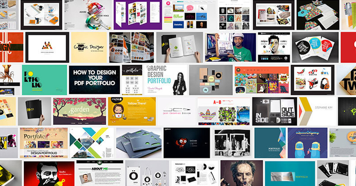
(1.) A website is a must, and it has to be clean, user-friendly, and optimized for mobile. If it’s not all three, it’s hurting you more than it’s helping.
Designers should have a portfolio, and this lets people know you’re serious, and it also gives you a chance to learn how to make a website if you haven’t already.
I learned early on that while lots of people needed a logo or some flyer, many of them needed a site as well, so I had to figure it out.
(2.) Some people want to see a book too – a physical portfolio. If you want to go that route as well, make sure it’s modular and that it only showcases your best work, by getting one with removable pages, and designing your layout to be flexible. This way, adding or removing a page won’t cause you to have to redo the whole thing.
Also, and this is the hardest one for me, try to keep it current. I find that’s difficult because I can’t pay myself for the time I’m spending on my own stuff even though I know it’ll pay off in the end.
While you can’t pay yourself to update your site either, and you probably can’t afford to design and re-print your book every week, it’s worth it to make the time. (If I keep saying it, maybe I’ll follow my own advice!)
When an opportunity comes knocking, you don’t want have to stall them for a few days while you get your stuff together – trust me, that sucks. Designers should have a portfolio and keep it up to date even though it’s hard.

When it comes to the site or the book, I also try and add a bit of context to the work. If I show someone a billboard ad next to a magazine ad, they might not know the difference or what goes where, depending on their skillset. All they’re seeing is rectangles, after all.
If it’s an art director, they probably get it, but if it’s some HR person, they might not. Using mockups helps here too. There are tons of good ones for purchase online, and some decent ones for free as well, but be careful with those free ones. Sometimes you’ll get a surprise, and there’s no going back on the time you’ve wasted finding/using it. Just Google “Photoshop (put deliverable here) Mockup,” where the deliverable might be a logo, business card or mobile app UI.
In the same vein, design for the lowest common denominator, and add a bit of text. Some helpful info might include your role in the project, the goals, how you helped achieve them with your solutions, any pinch-points you may have encountered (like print specs changing last minute and having to adjust colors, not like your dog dying) and how you overcame them.
It’s up to you how in depth you want to go here, but a couple paragraphs or a few concise sentences ought to do the job. This will also help you be a bit more confident talking about your work. Now you’ve got a cheat sheet of what to say instead of stuttering nervously.
I’ve got more written content in my book than my site because people actually read books, but they just scan websites. (I don’t actually have a physical book anymore – I gave it away, but more on that in another post.)

(3.) It’s 2017, and everybody’s eyes are on social, so you have to put stuff on social. Easy enough, right? It depends on who you ask.
I’ve got a bit of strategy to what I put where (Site, IG, Facebook, etc.) and I don’t solicit work when I post on social media.
“Hey, just in case everybody forgot after 5-6 years of me doing this, I’m a multi-disciplined designer with a heart for purpose-driven causes.” I just post stuff that reflects my work in between Dallas Cowboy memes, and pictures of my family, etc.
Again, show, not tell. It’s social media after all, so be careful not to abuse it.
(4.) Finally, I like to keep a little photo album in my phone to show as well. This is the plan B, C, D. In case I’m in some elevator, and there’s no WiFi, and I’ve got a poor connection on data, I can just hand them my phone and let them flip through a few pics and ask their own questions.
In addition, whenever I’m showing someone my work, I ask them right up front if they wanna just look at it themselves, or if they want some explanation to what’s going on here.
This is where I’d tell them a quick story about the project. Something funny, warm, whatever, as long as it’s memorable.
I learned this from one of my teachers at LSCCF. She told us that not only should designers have a portfolio, but they should be able to explain it only if the person on the other end wants the explanation – otherwise, you’re rambling and likely distracting them.
Being able to share your work at any time, and via multiple mediums is paramount for what we do.
It takes a bit more explaining (to some folks) when you get into thinks like Content Strategy or SEO, but you still have to have some pictures to show them.
In the next blog, I’ll talk a little bit about faking it til you make it, errr, inventing your clients. It’s a phenomenon that I continually have to remind myself to practice.


